


KEYTAKEAWAYS
- The Bitcoin Rainbow Chart is a long-term analysis tool that uses colored bands to indicate market sentiment and valuation zones.
- It can help identify ideal buy zones, potential bubble conditions, and optimize DCA strategies for crypto investors.
- Investors should avoid relying solely on the chart—combining it with market research and short-term indicators is essential for smart decision-making.
CONTENT
The Bitcoin Rainbow Chart helps visualize Bitcoin’s long-term price trends using color bands. Learn how to read it, use it strategically, and avoid common investor mistakes.
WHAT IS THE BITCOIN RAINBOW CHART?
The Bitcoin Rainbow Chart is a visual tool designed to track Bitcoin’s long-term price trends. Developed by the crypto community, it uses a logarithmic regression curve overlaid with rainbow-colored bands to represent different stages of the market cycle.
By using the Bitcoin Rainbow Chart, investors can easily assess whether Bitcoin is undervalued, fairly priced, or in a potential bubble zone. This makes it a popular reference for long-term holders and crypto enthusiasts looking to better understand market sentiment and timing investment decisions.
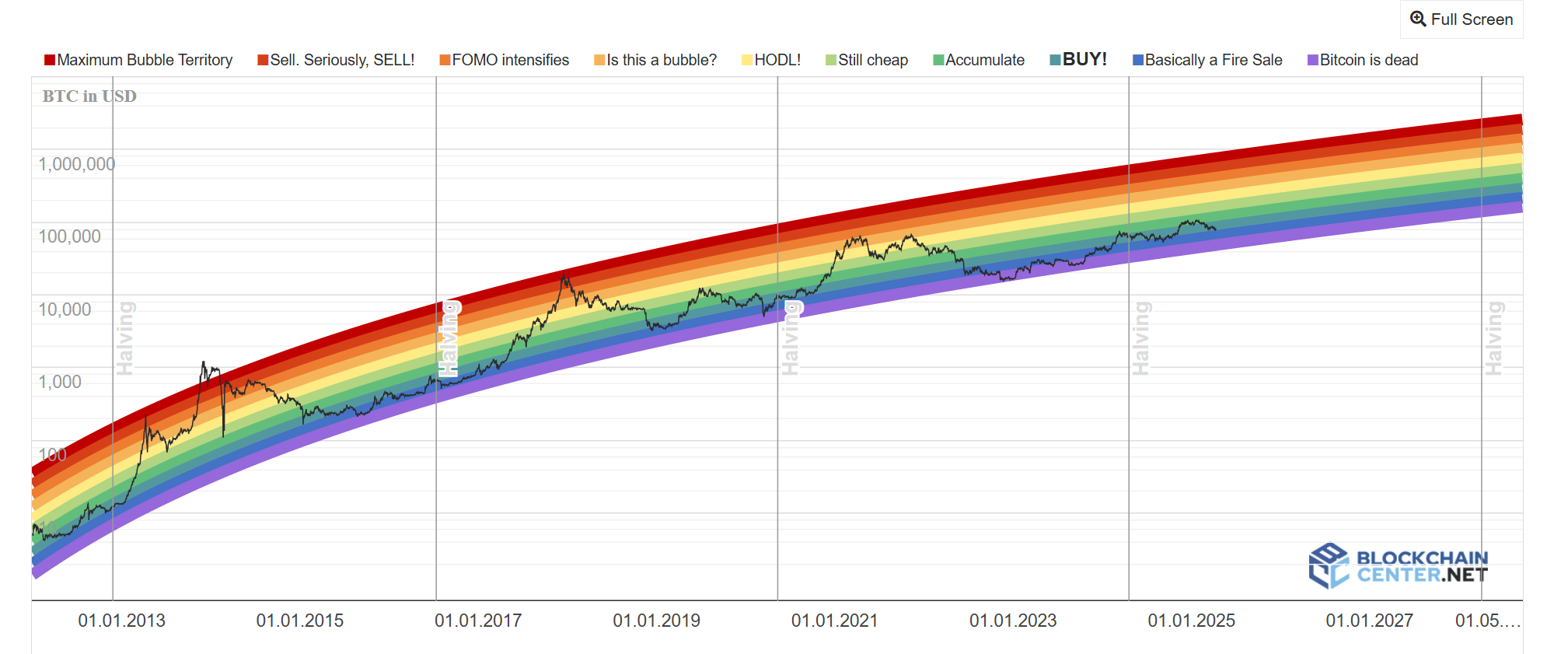
📌 How to Interpret the Color Bands?
Each color band in the Bitcoin Rainbow Chart represents a different level of market sentiment and valuation. Here’s what each color means:
🟣 Purple – Bitcoin is Dead
Extreme fear zone. The market has lost all confidence.
🔵 Dark Blue – Fire Sale / Light Blue – Buy Zone
Prices are considered heavily undervalued. Ideal for long-term investors
looking to accumulate.
🟢 Green – Accumulate / Light Green – Still Cheap
The market is showing early recovery. Great opportunity for Dollar-Cost Averaging (DCA) into Bitcoin.
🟡 Yellow – Hold
Neutral valuation. Investors are encouraged to hold existing positions.
🟠 Orange – Is This a Bubble?
Potential overheating. Caution is advised before making large investments.
🔴 Red – FOMO Intensifies / Dark Red – Maximum Bubble Territory
Highly overvalued zone. Market euphoria at its peak—consider taking profits or avoiding buying at this stage.
>>> More to read: What is Quantitative Tightening & How Does it Affect Crypto?
HOW TO USE THE BITCOIN RAINBOW CHART
To use the Bitcoin Rainbow Chart effectively, it’s important to combine its insights with sound investment strategies. Here’s how to apply it to your crypto investment decisions:
✅ Identify Optimal Buying Opportunities
Historically, when Bitcoin’s price enters the dark blue or light blue zones, it has signaled undervaluation and strong long-term buying opportunities.
For example, during the 2018 crypto winter, Bitcoin hovered around $3,000–$4,000 in the “Fire Sale” zone. Investors who bought in these bands saw massive gains in the following bull cycles.
✅ Know When to Take Profits
When Bitcoin enters the red or dark red zones, it typically indicates overvaluation and peak market euphoria.
Notable instances include the 2017 top around $19,500 and the 2021 peak near $64,000, both falling in the “Maximum Bubble Territory.” Investors who exited positions in these zones were able to lock in profits and avoid major drawdowns.
✅ Enhance Dollar-Cost Averaging (DCA)
The Bitcoin Rainbow Chart can help fine-tune your DCA strategy.
When prices enter the green or light green zones, consider increasing purchase frequency or volume. During higher-risk zones like orange or red, you might scale back to preserve capital and reduce average acquisition costs.
>>> More to read: What is Dollar-Cost Averaging (DCA) in Crypto?
BITCOIN RAINBOW CHART: COMMON INVESTORS MISTAKES
While the Bitcoin Rainbow Chart is a powerful long-term trend tool, misusing or misunderstanding it can lead to poor investment decisions. Here are three common mistakes—and how to avoid them:
⚠️ Overreliance on Historical Data
A common misconception is assuming that past trends can guarantee future results. Although historical price patterns offer valuable insight, Bitcoin remains sensitive to unexpected market conditions, regulatory changes, and global macroeconomic events.
➤ Solution: Use the Rainbow Chart alongside both fundamental and technical analysis. Platforms like Bitget offer robust trading tools and in-depth market reports to support well-rounded decisions.
🎨 Misinterpreting the Color Bands
Misunderstanding what each color zone represents can trigger poor reactions. For example, when Bitcoin enters the yellow “Hold” zone, some new investors may panic sell—mistakenly viewing this neutral signal as negative.
➤ Solution: Learn the meaning of each color band in the chart and cross-check market sentiment from multiple reliable sources before making major investment moves.
📉 Ignoring Short-Term Market Volatility
The Bitcoin Rainbow Chart is best used for long-term trend analysis. Traders attempting to use it for intraday strategies may suffer from poor timing and losses due to short-term volatility.
➤ Solution: Clearly define your investment horizon. Combine the Rainbow Chart with short-term indicators like Moving Averages or RSI to build a more complete trading framework.
>>> More to read: What are CPI & PPI? Essential Knowledge for Crypto Investors
BITCOIN RAINBOW CHART FAQ
1. Can I use it for short-term trading?
No. It’s best for long-term trend analysis. Use other indicators for short-term trades.
2. Does it work for other cryptocurrencies?
Not directly. It’s specifically made for Bitcoin. Other assets need tailored charts.
3. Where can I view the chart?
Available for free on various crypto websites and forums.
4.How often is it updated?
Regularly, but the frequency depends on the source. Use a trusted site.
5.How should I use it in investing?
As a long-term tool—combine it with news, technicals, and your financial goals.
6. Is the chart still relevant today?
Yes. It remains a useful tool for spotting market sentiment and valuation zones.
▶ Buy Crypto at Bitget
ꚰ CoinRank x Bitget – Sign up & Trade!